case study
#03
OUTPOST
MENTORSHIP
GUIDANCE
MOBILE APP
Google UX Course - Case Study #3
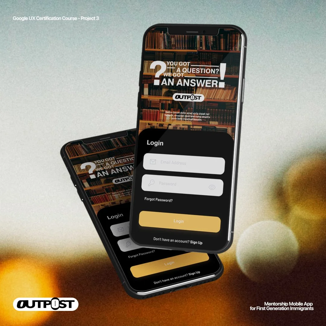
The purpose of this mentorship app was to be able to provide guidance to first generation immigrants regarding topics they wouldn’t normally have encountered growing up in their household or immediate environment.
The Product
Majority of first generation immigrants do not have a direct or convenient ways to access guidance/advice from from trusted sources which they would normally find with either their relatives, role models, or peers.
The Problem:
The goal:
To be able to provide a platform for first generation immigrants to seek answers to their advice and guidance when navigating through situations they encounter in life through trusted experts and verified personel.
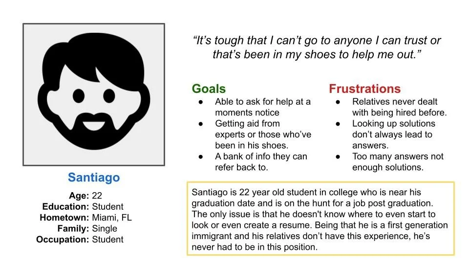
Before going forward with the ideation phase of this project I went ahead and created personas to best pinpoint how to bring the best present a design solution.
persona one:
Problem statement: Santiago is a first generation immigrant who needs advice on how to apply for corporate jobs because he has no experience doing so.
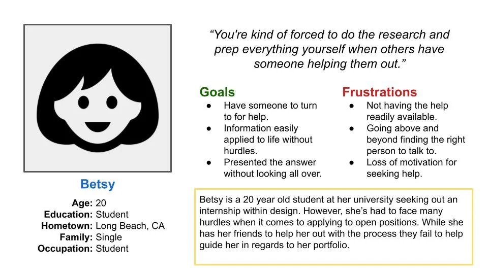
persona two:
Problem statement: Betsy is a first generation immigrant student who needs advice on how to seek out an internship because his relatives don’t have experience.
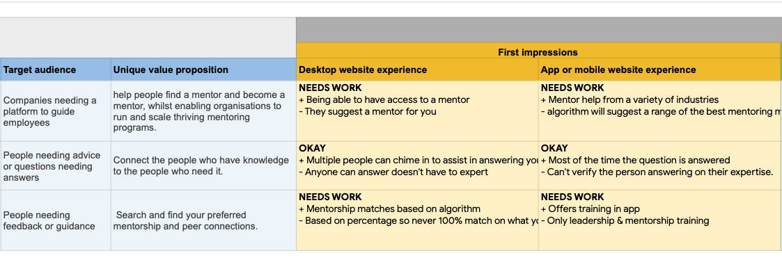
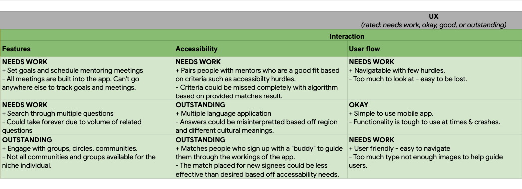
competitive audit
Now that the personas have been created to best represent the demographic that would be the basis of this project, I went on to gather a list of competitors that would be a direct or indirect competition to my mobile solution. This would propel me to create a competitive audit in order to asses the competition’s solutions and what their products lack.
ideation:
The thought process behind this initial draft was to create an exercise to be able to help guide users in this case first generation immigrants to what they are looking for with as less hurdles as possible. That way I am able to create an all inclusive space no matter the online literacy a user may posess.
Low-fidelity WIREFRAMES
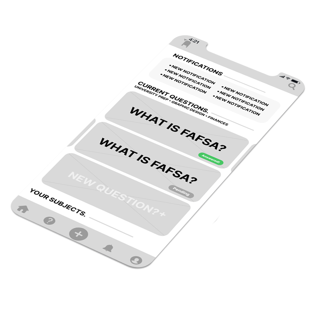
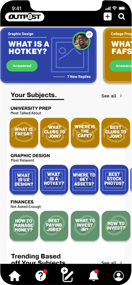
The flow of the app is intended to streamline the main navigational route while also highlighting anything user’s would be looking for such as topics or anything that’s currently trending within their selected subjects.
mOCKUPS
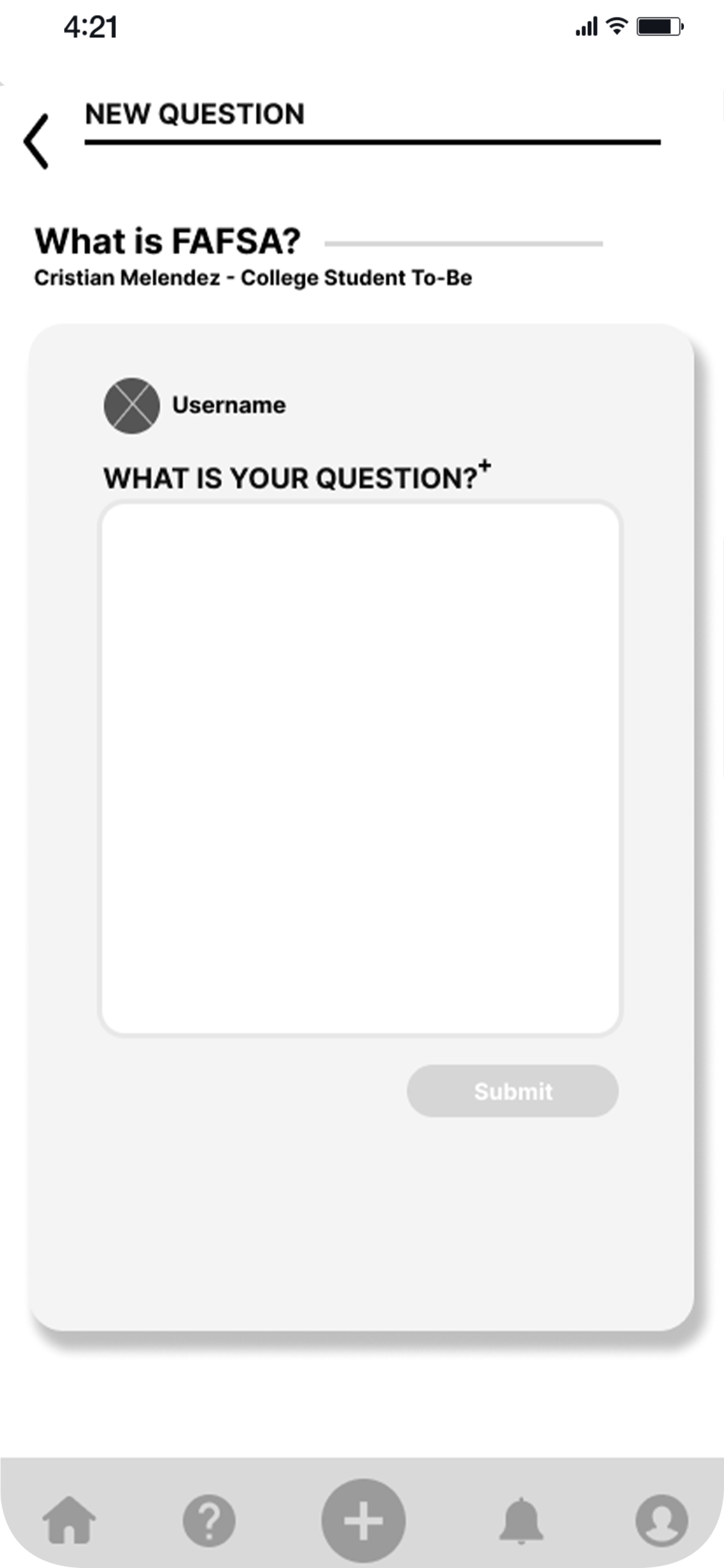
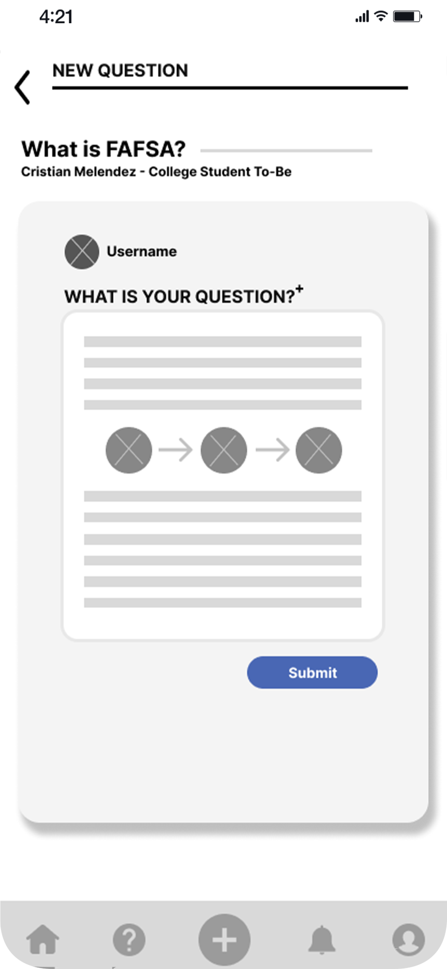
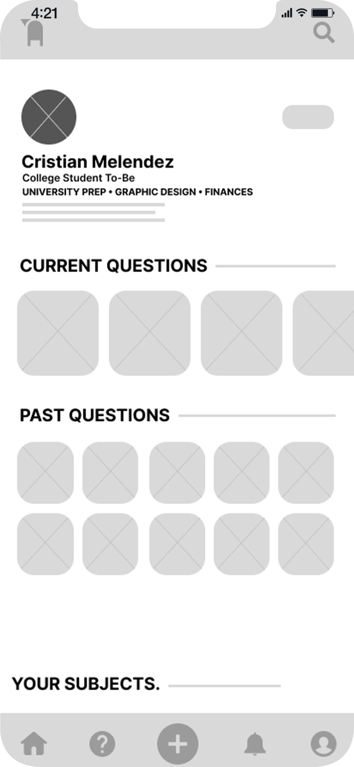
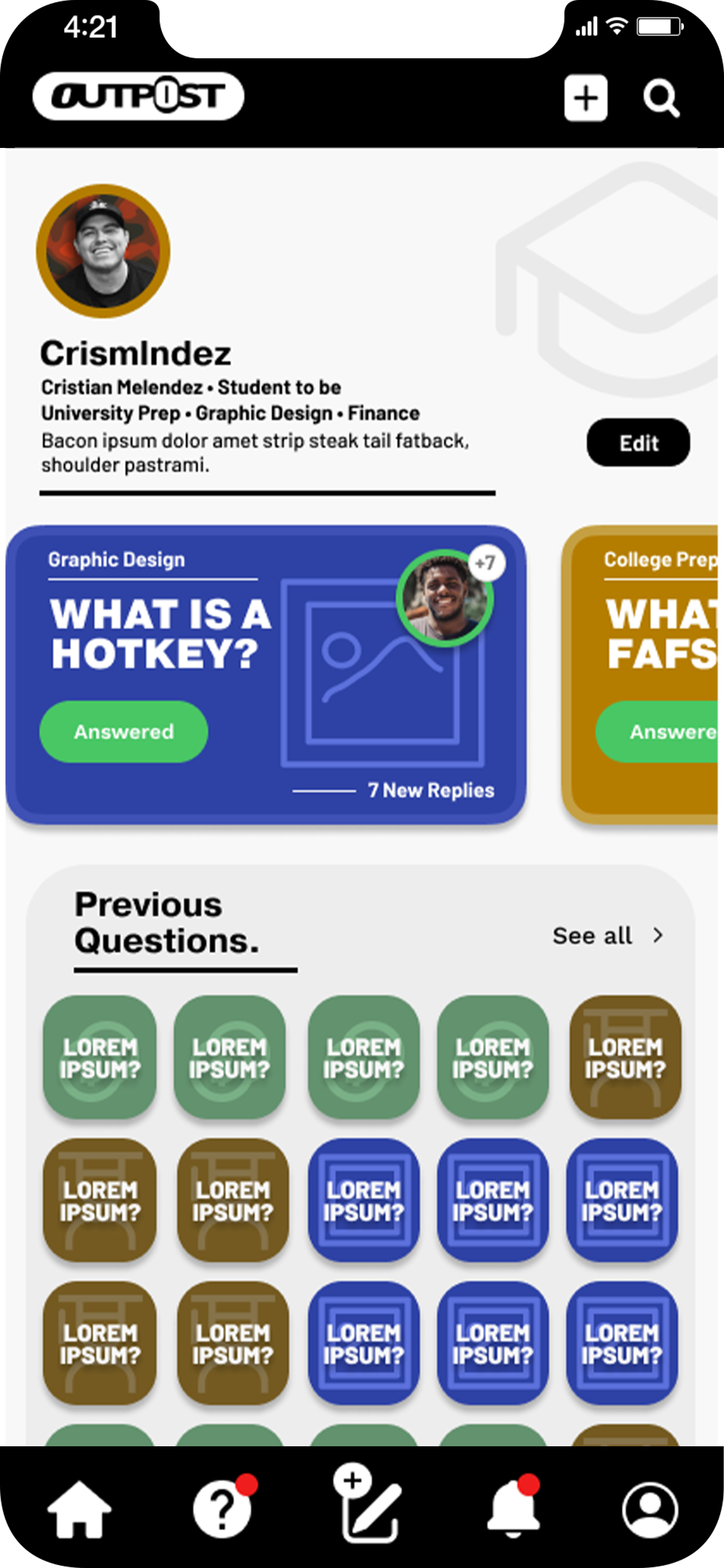
While I considered that the app had ample ways to be navigated through. Some of my peers and colleagues felt that the selected questions that users have active or were answered and previously active should have their own dedicated page to act as a reference to further supplement user’s profile pages.
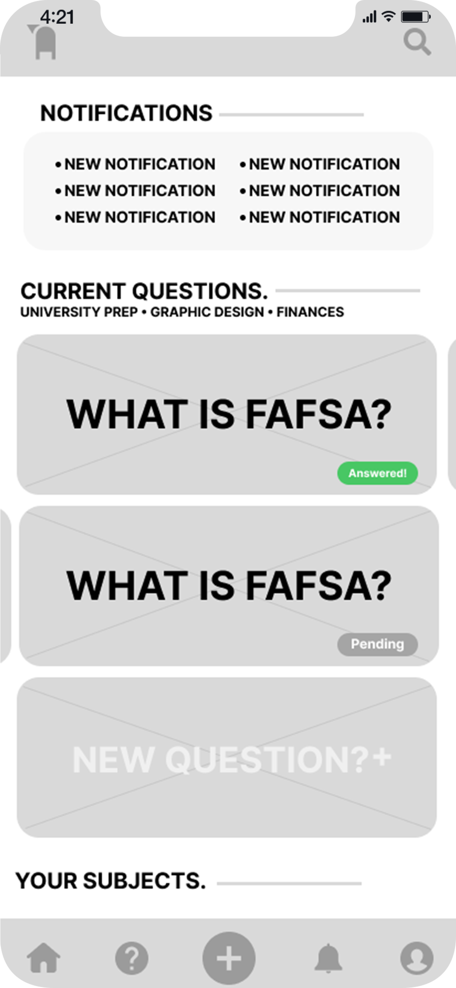
high-fidelity WIREFRAMES
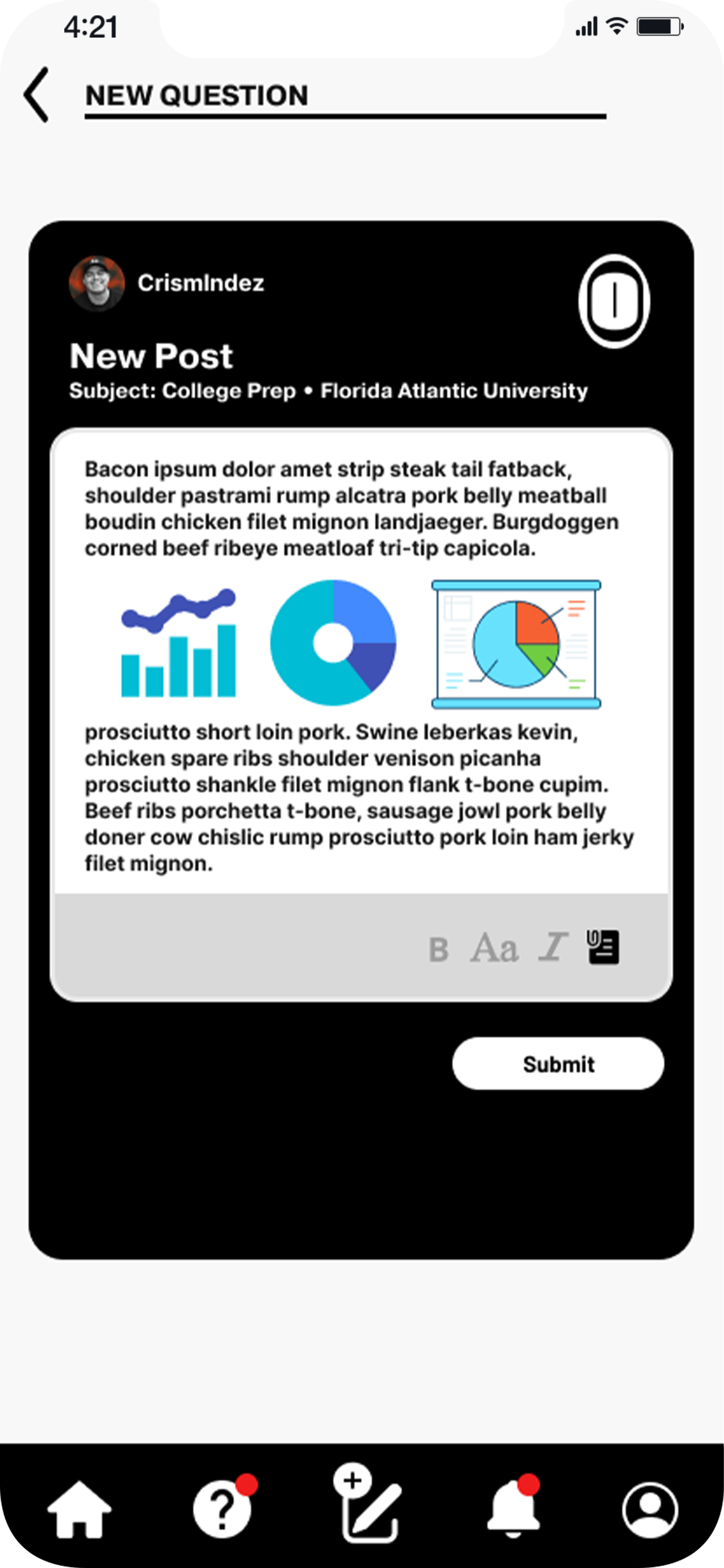
The way everything was laid out on the homepage was a bit crowded according to colleagues that initially tested out the navigation to and from. Therefore, I made the appropriate edits to make the screen’s layout more concise and obvious to indicate where it would lead to.
This was done by scaling up the design’s contents providing a more concise and navigable flow. Which in turn further propelled the overall design and structure.
The impact of my designs would be not only felt within my own community but those who have been in my own shoes being that I also am a first generation immigrant myself. Having a tool and resource like this would be so beneficial to those who need the guidance while traversing through the same hurdles I did. Especially, having access to such a tool at any time no matter what the topic.
tHE IMPACT:
What was learned
Thank you for taking the time
to go through Case Study #2.
If you ever want to chat,
please do not hesitate to do so!
Email: Cristian@melendezmotions.com
Website: melendezmotions.com
Throughout the project, I learned that not everyone within their own community has immediate access to people or resources to help guide them on how to go through life’s obstacles. Having a resource like this would benefit a variety of people including myself especially when I needed the help on how to even begin to apply to college.
