CASE STUDY
#01
tHE
pARK app
Google UX Course - Case Study #1
The Product
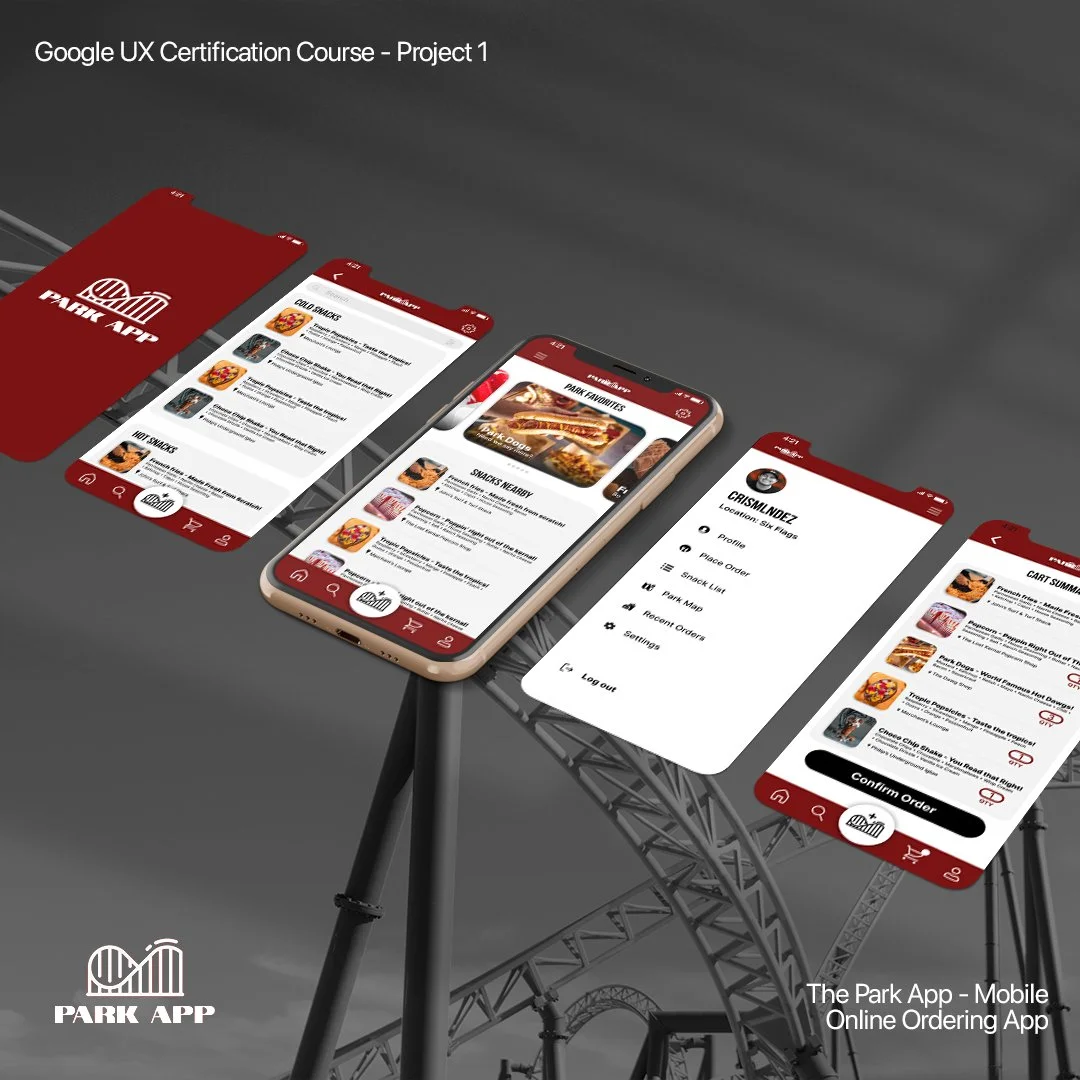
The app is based around being able to provide a linear and easy way to order snacks, food, and drinks at an amusement park, therefore eliminating the pain point of long lines.
•Figuring out a simple and accessible checkout process for a pick up order.
•Being unable to confidently place pick up orders due to interface or unfamiliarity.
•Long lines at amusement parks leave less time for rides and overall park enjoyment.
The Problem:
The goal:
To create an app space that seems familiar and universal for most if not all users without having to search for the main purpose of the app.
In order to help reinforce this solution for users, personas would have to be created to help with those pain points and achieve all-inclusivity.
persona one:
Problem statement: Gloria Valdez is a married hispanic mother of two who professionally cleans family homes for a living who needs multiple located orders for children to pick up from because it would take the stress off of her to do it all on her own.
persona two:
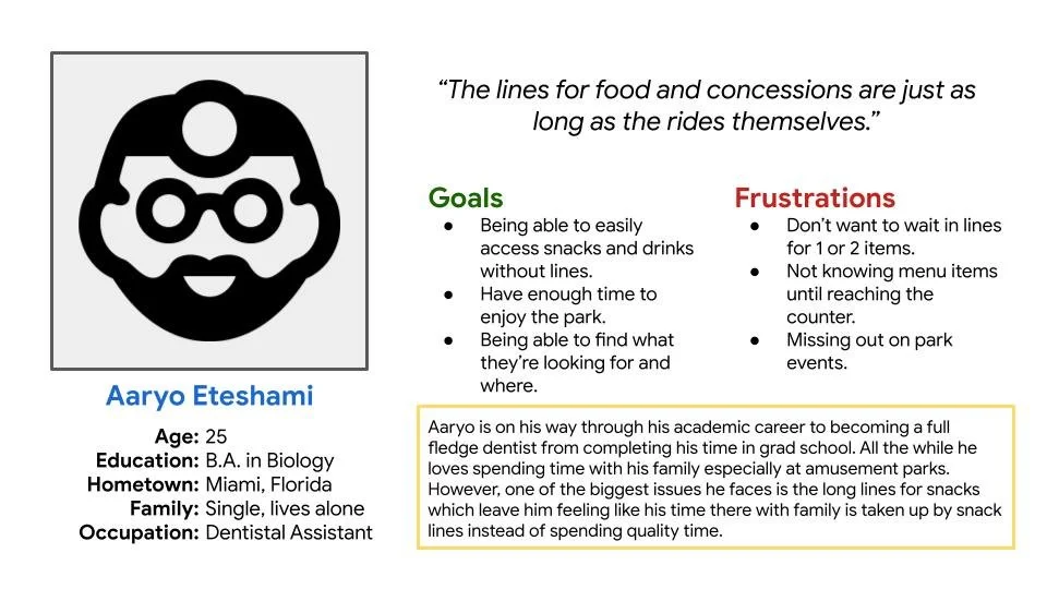
Problem statement: Aaryo is a graduated dental student who enjoys turkey legs and spending his time at amusement parks with his family. However, due to long lines for snacks at the parks he spends the majority of his time waiting in line just to place an order.
competitive audit
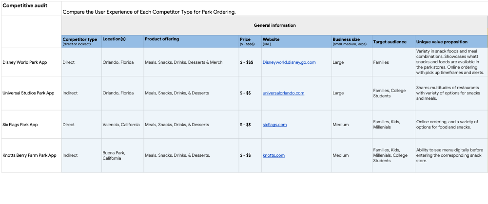
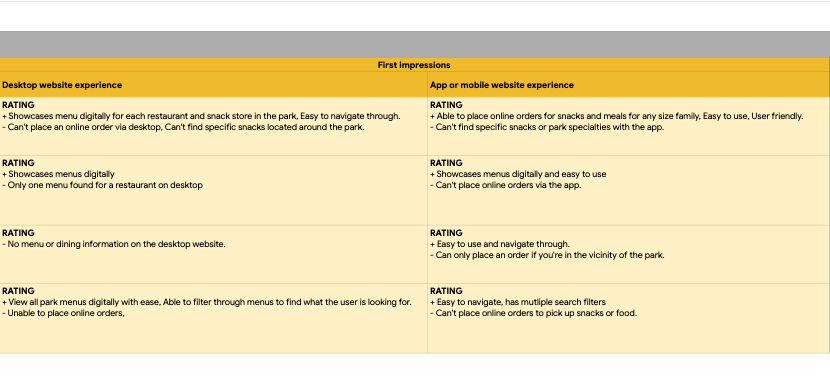
In order to better accommodate users for smooth interactions that further complimented the intended use of the product, a competitive audit was conducted. I took into consideration a variety of competitors that have an online ordering app for their respective amusement parks and compared them to each other to see how they varied from either being beneficial or not regarding from a functionality/design standpoint.
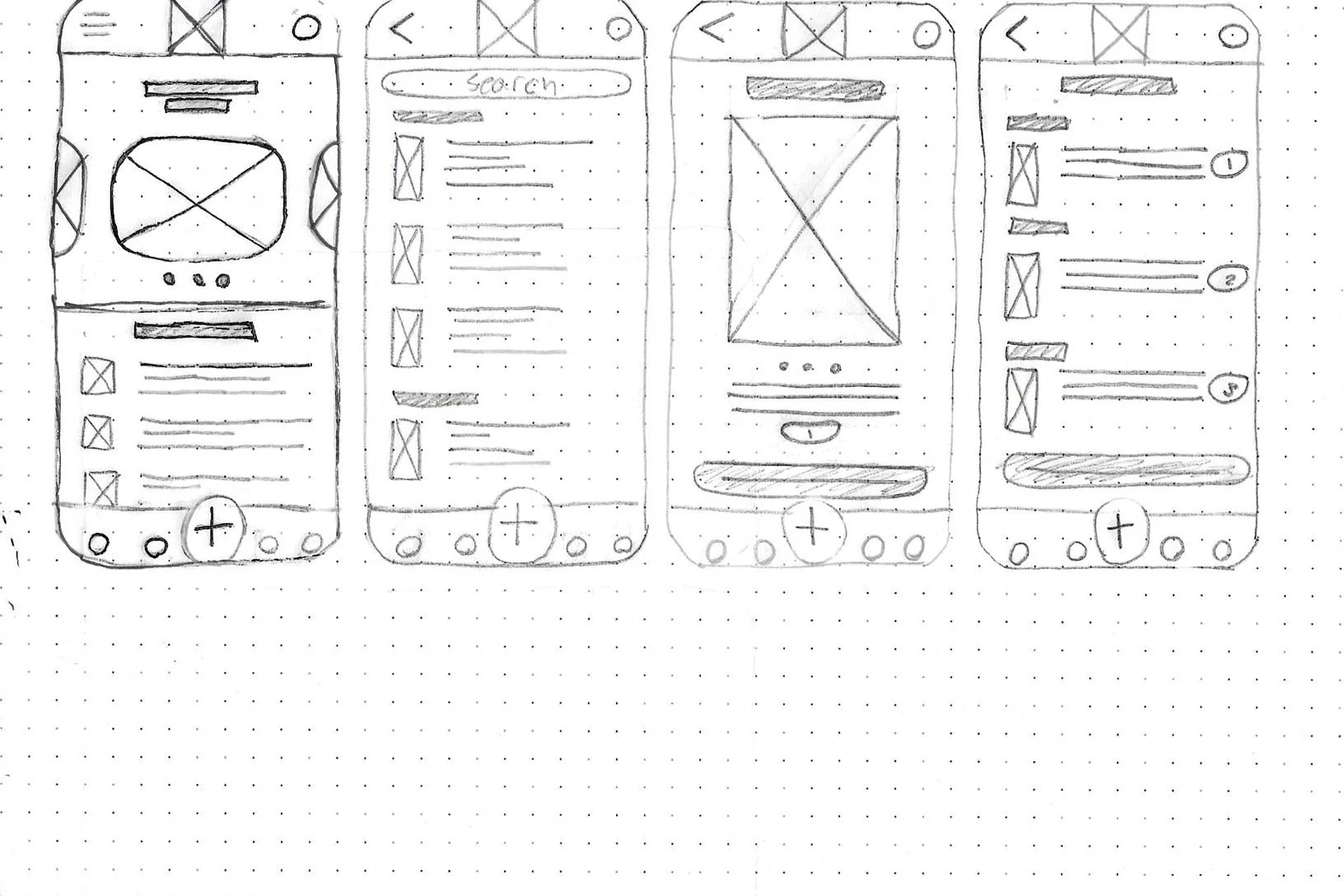
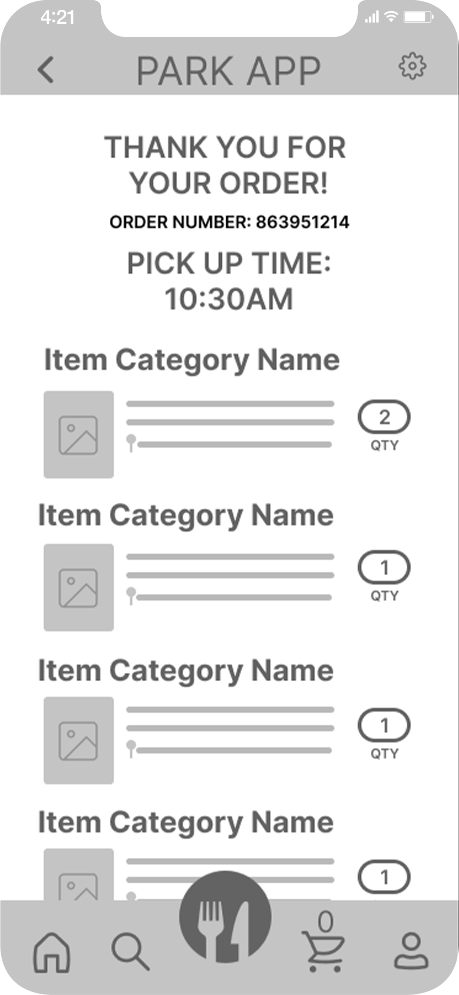
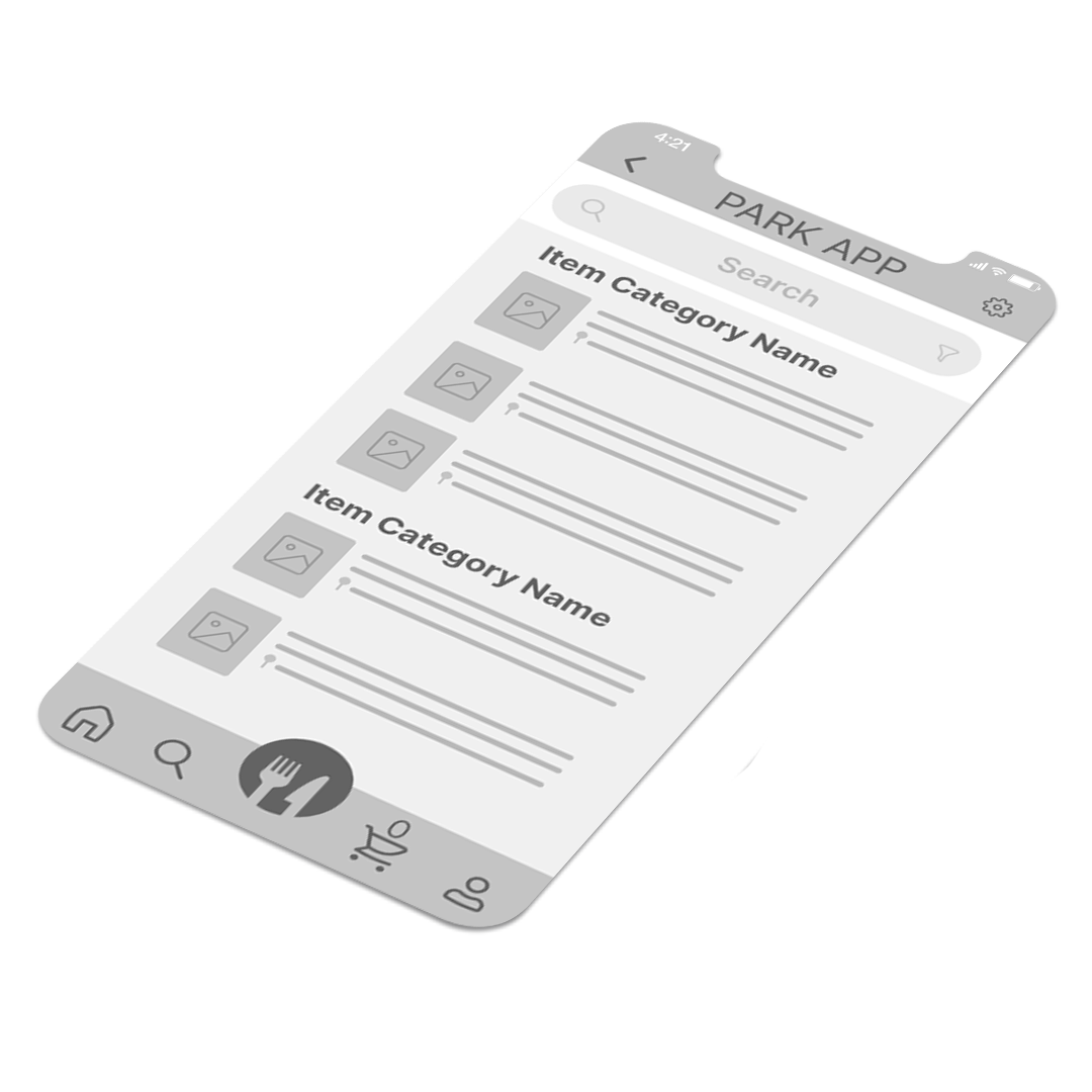
The goal for the initial wireframes was to create a mix between placing an order through a grocery app and an online ordering delivery app. I wanted to make the interface to be as user friendly as possible to make any user feel comfortable while making it feel familiar to place an order.
ideation:
Low-fidelity WIREFRAMES
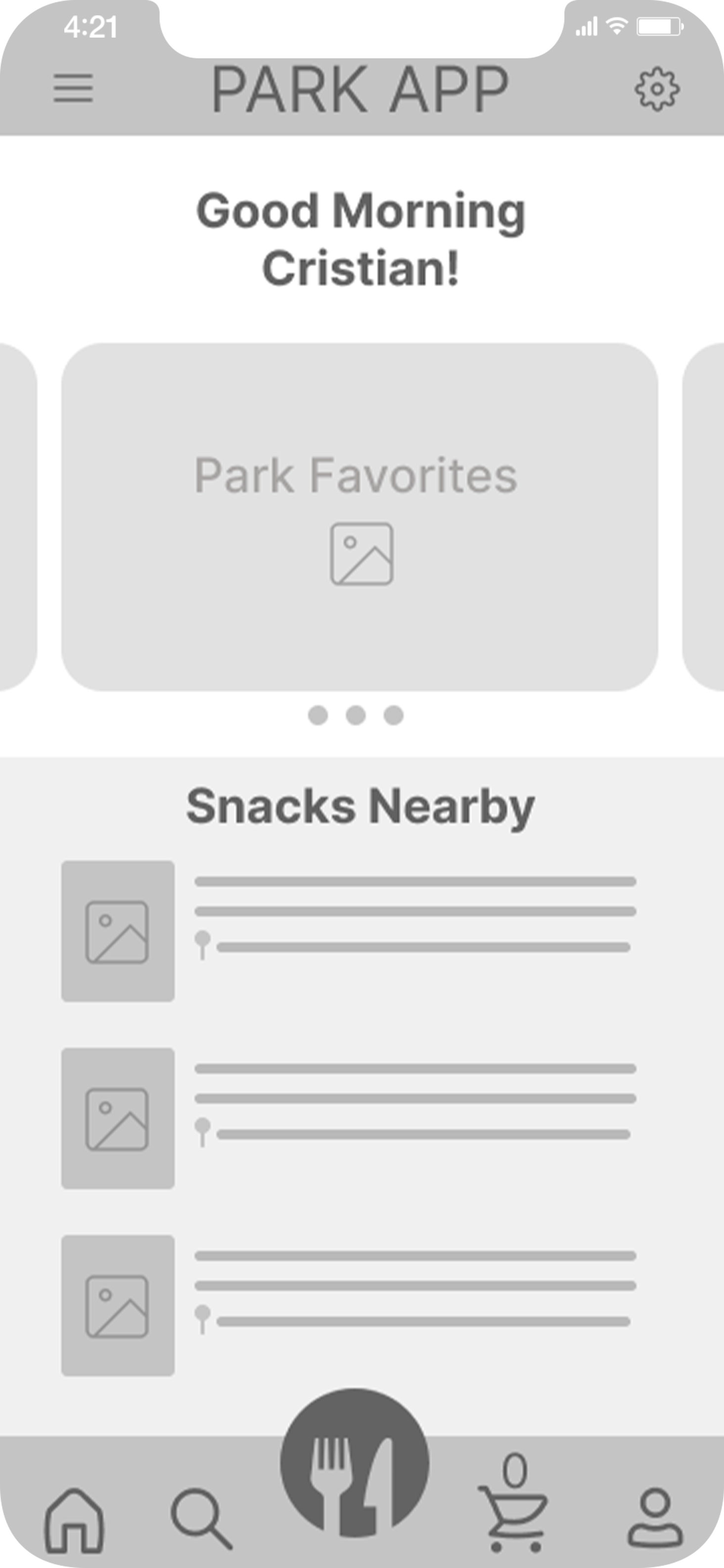
By translating the paper wireframes to digital I was still mindful about not overcomplicating the general design space or bombard the screens to confuse users on how to properly follow the intended path set. I also added in a few more touches to the initial mockups by adding in the location of where each snack is to better simplify the user’s choice if that were a factor in their decision making process.
Once low-fidelity wireframes and the accompanying prototype was made I went forth and received feedback from my peers which in turn determined that the main button of navigation needed to be more clear than the fork and knife. This would cause confusion among users since the icon wouldn’t translate to its variety of navigation paths a user would take. Therefore adjustments were made.
mOCKUPS
HIGH-fidelity WIREFRAMES
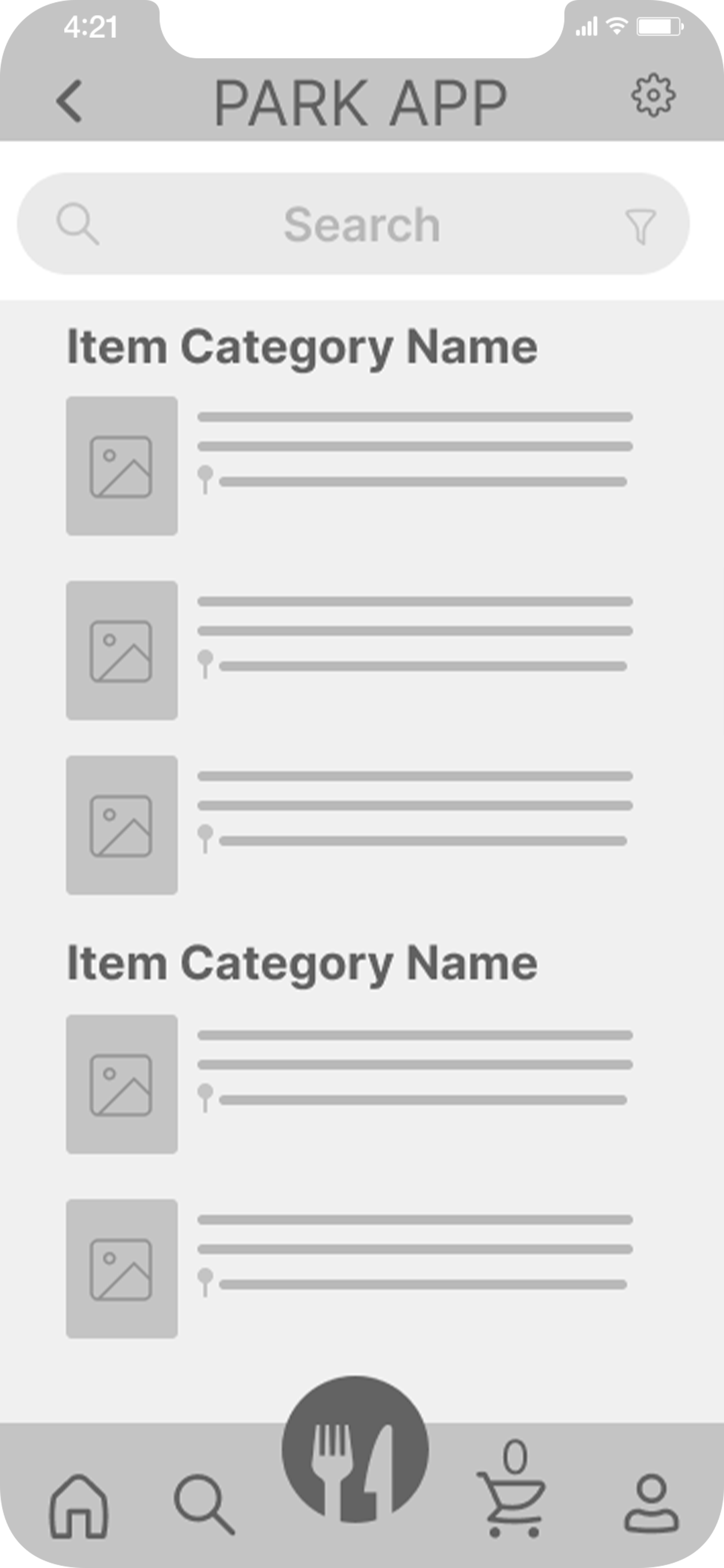
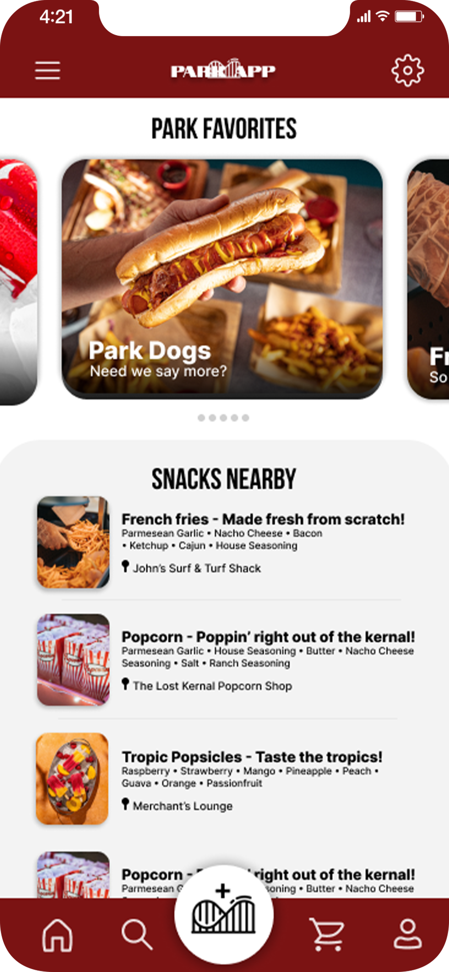
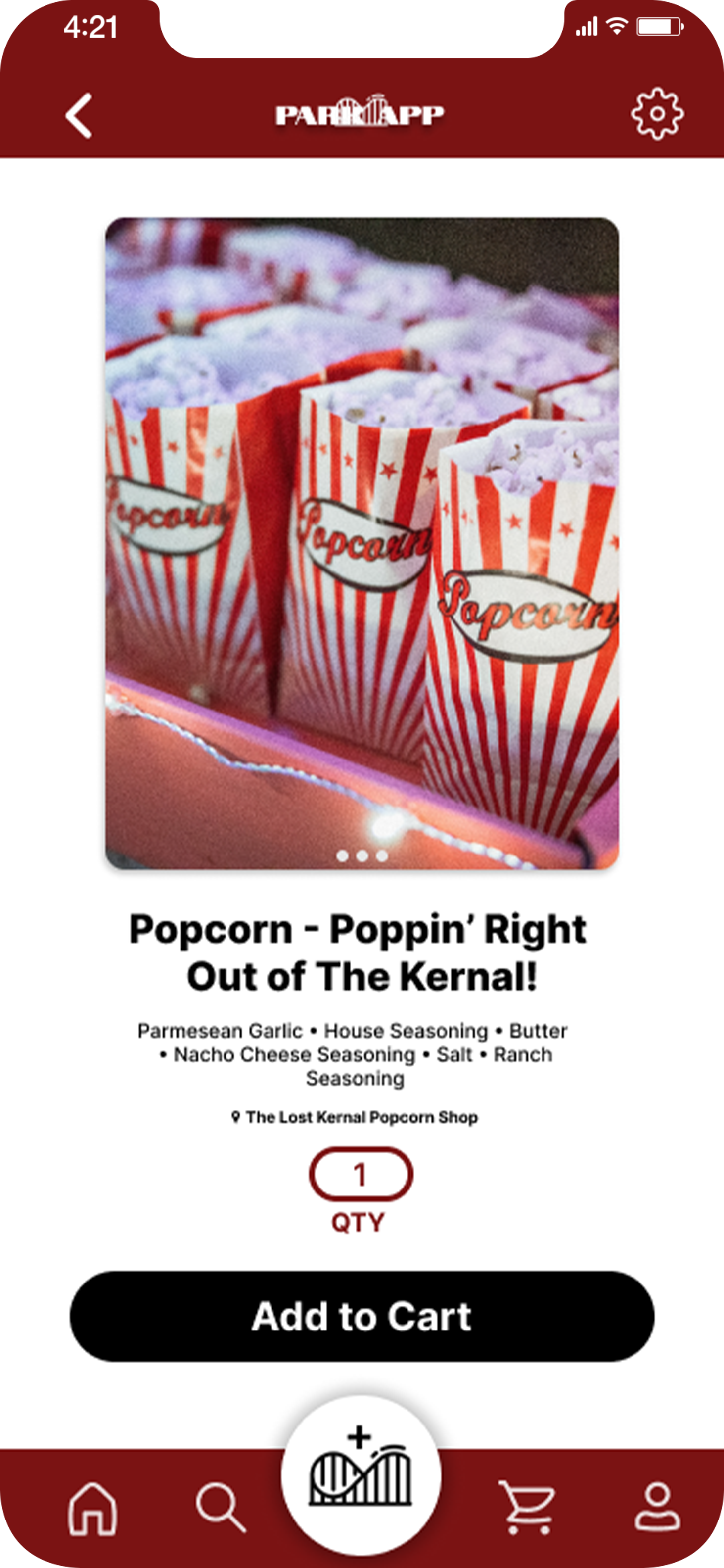
Further improvements were made on the low-fidelity wireframes such as reworking the items page due to the lack of grouping needed to differentiate between item categories and differentiating colors via hierarchy to best suit users with accessibility needs. That way I can accommodate to a wider user base. While of course overall polishing the each screen.
Simplifying and making an amusement park online ordering platform that everyone can use without any complications is key of what I was trying to accomplish within the course parameters. "Simple and to the point. I like it! Feels exactly how an ordering process should” as my peer stated.
tHE IMPACT:
What was learned
Throughout this project, I learned a multitude of skills such as being aware of accessibility needs, spacing/grouping, and learning to place myself in the shoes of the user. The culmination of all I learned throughout the way was key to being able to create a user expereience that was able to be understood by my peers and those among them.
Thank you for taking the time
to go through Case Study #1.
If you’d ever like to chat,
please do not hesitate to do so!
Email: Cristian@melendezmotions.com
Website: melendezmotions.com
