CASE STUDY
#02
DJ Grocieries
Online Ordering
Website
Google UX Course - Case Study #2
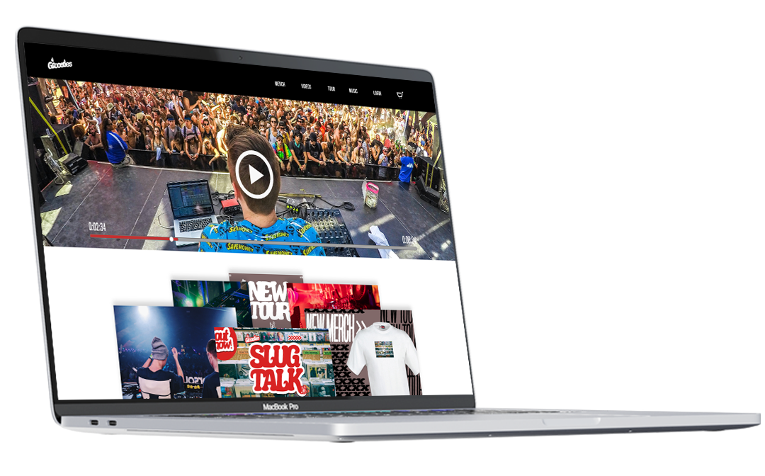
The product is an online ordering website for a DJ with its main functionality including merchandise sales, music streaming, and physical album purchases. All while offering the usual navigations and pages a user would find in an artist’s respective page.
The Product
•Not being able to access a single destination to enjoy everything a DJ would have to offer.
•No built in album purchases dedicated to online streaming via website.
The Problem:
The goal:
The main objective is to be able to provide fans/users with a linear and straightforward purchasing experience that’s both enjoyable and simple enough for any user to navigate through regardless of online literacy.
ideation:
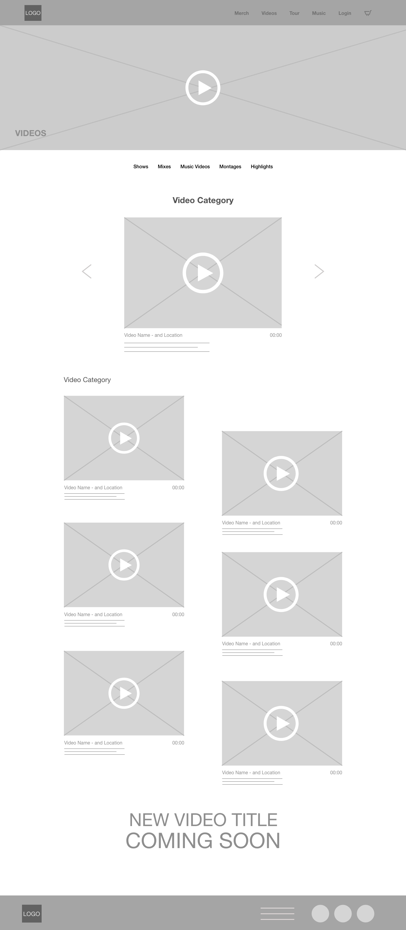
My thought process behind these paper wireframes was to create pages and navigations that would feel familiar to most if not all users. As a designer we can forecast the demographic that would be more likely to go through the site, however we can never omit the needs of those who aren’t familiar such as family members shopping for gifts. Therefore, making every respective page have its own feel to it while also easily accessible would create a unique, yet familiar interface.
Low-fidelity WIREFRAMES
Once I created the first draft of the low-fidelity screens. My peers suggested I add in a login page so users could track all of their info, music, events, and purchases they’ve made both present and in the past. With that in mind I also implemented more visuals than typography to draw more emphasis on navigation through imagery.
mOCKUPS
During my initial walkthrough of my low-fidelity screens, I noticed that rather providing more text to lead users around the site, I should implement more imagery to guide users to their intended destination. This would open the door to more navigation routes than just one. Which is made possible by being image driven than typography based.
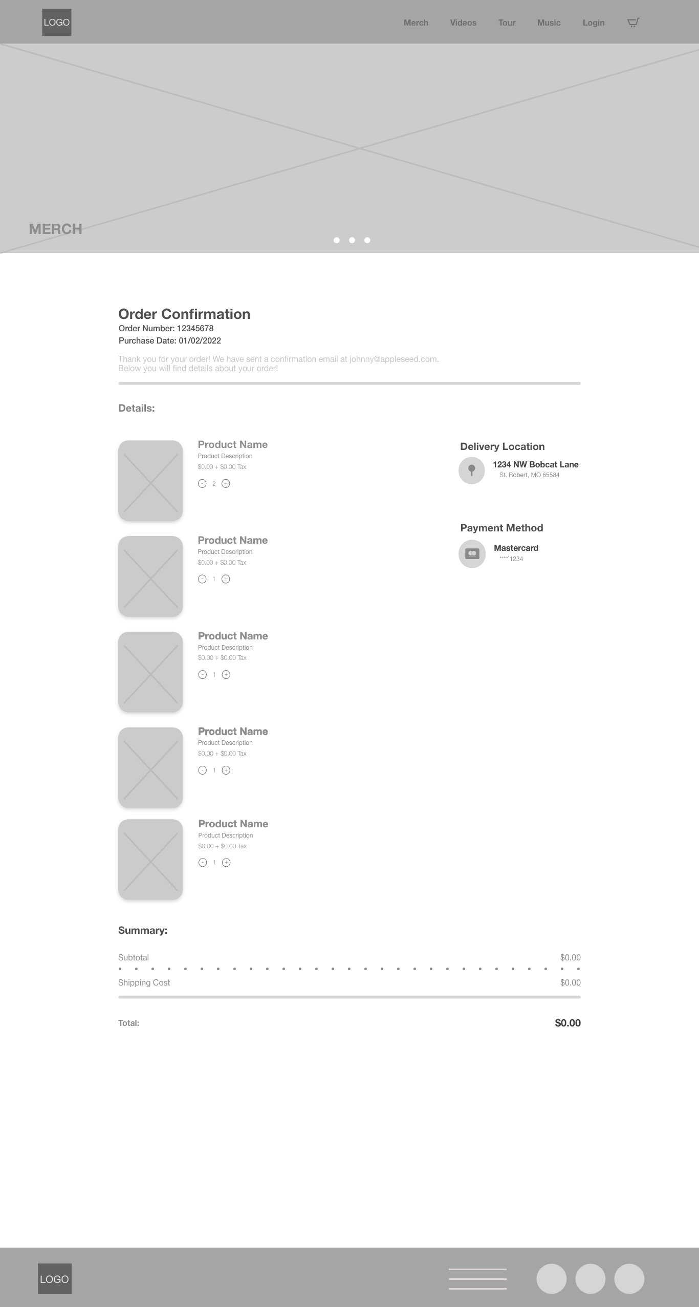
HIGH-fidelity WIREFRAMES
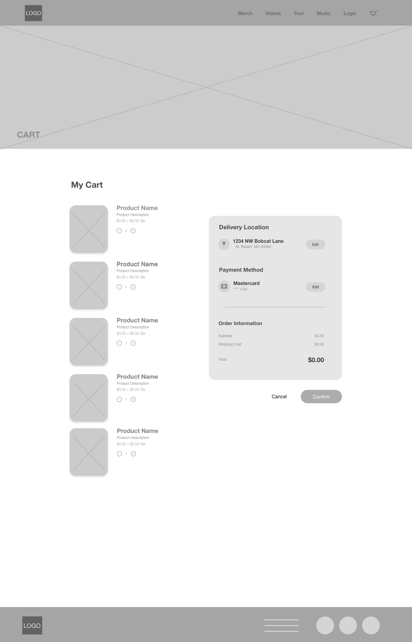
While discussing feedback with some of my peers once the first draft of the mockups were created. They mentioned that while going through the ordering process via prototype that they didn’t come across an items page.
Therefore, I created one to better simulate the online ordering process.
Having gone through multiple references between artist and fashion online ordering web pages. It was really refreshing creating an iteration of two separate industries into a single user-friendly web page that I trust that anyone can navigate through. Just as one of colleagues had mentioned before when embarking on this project, "It should be simple and do what it needs to do."
tHE IMPACT:
What was learned
Throughout the project I was able to learn that while I may think a certain design element is favorable. It's important to learn from users testing feedback and harmonize your own knowledge to their feedback to create the best iteration of the final product.
Thank you for taking the time
to go through Case Study #2.
If you ever want to chat,
please do not hesitate to do so!
Email: Cristian@melendezmotions.com
Website: melendezmotions.com
